A step-by-step guide for researchers — what a graphical abstract is, what journals expect, and how to make one without spending a weekend in Illustrator.
More and more journals — Cell, Elsevier titles, and many others — now ask for a graphical abstract when you submit. If you've just finished your manuscript and hit that one nagging requirement, this guide walks you through exactly what to make and how, based on guidance from Cell Press, Springer Nature, Elsevier, and the widely cited Ten Simple Rules for Designing Graphical Abstracts (Jambor & Bornhäuser, PLoS Computational Biology, 2024).
What is a graphical abstract?
A graphical abstract is a single image that captures the main message of your paper at a glance. It's not a figure from your results section, and it's not a summary of every experiment — it's a visual headline. A reader should look at it for a few seconds and understand the core finding: what you studied, what you found, and why it matters.
Think of it as complementing your written abstract, not replacing it. The written abstract carries the detail; the graphical abstract carries the idea.
Why bother making one?
A good graphical abstract does real work for your paper:
- It's often required. Many journals now mandate one at submission.
- It increases visibility. Graphical abstracts are shared on journal websites, social media, and at conferences — they're how people encounter your work before they read it.
- It aids comprehension. A clear visual helps readers from adjacent fields, and non-specialists, grasp your contribution quickly.
- It can support citations. Work that's easier to understand and share tends to travel further.
What to include (and what to leave out)
The single most common mistake is cramming in too much. Every source — from Cell Press to Elsevier's own guidelines — says the same thing: one key message, minimal text, clean flow.
Include:
- One main message — the single takeaway, distilled even shorter than your written conclusion.
- A logical flow — start at the beginning of your "story" and move intuitively, usually left-to-right (landscape) or top-to-bottom (portrait).
- Minimal text — labels and a few short phrases, in the same terms you used in the paper so nothing is misrepresented.
- Simple visual elements — icons, shapes, arrows, and where useful, a small data panel.
Leave out:
- Multiple competing messages.
- Dense paragraphs of text.
- Too many colors or fonts (a frequent cause of cluttered, amateur-looking abstracts).
- Raw, unsimplified result figures.
Step-by-step: how to make a graphical abstract
Step 1 — Find your one message. Before you open any tool, write a single sentence: what is the one thing a reader must take away? This sentence anchors the entire design. If you can't state it in one line, the abstract will be cluttered.
Step 2 — Sketch the flow on paper. Every design guide recommends this, and it genuinely helps. Rough out the story as boxes and arrows: input → process → outcome. Decide the orientation (check your target journal's required dimensions first — landscape, portrait, and square all have different storytelling flows).
Step 3 — Check your journal's specs. Before designing, pull up the journal's graphical abstract guidelines: required dimensions, file format, and resolution. Designing to spec from the start saves a painful re-do later. (For example, Cell Press and Nature each publish specific size and format requirements.)
Step 4 — Build it. Arrange your icons, shapes, arrows, and any data panels to follow the flow you sketched. Keep a consistent style: one font family, a limited color palette, unified arrow and line styles. Use color purposefully — to highlight, not to decorate.
Step 5 — Simplify, then simplify again. Step back and remove anything that isn't carrying the main message. De-cluttering is what separates a professional abstract from a busy one. If an element doesn't help the reader understand your key finding, cut it.
Step 6 — Export to spec and add a citation if sharing. Export at the journal's required resolution and format. If you'll also post it on social media or a lab website, include a citation to the article so people can find the paper.
Tools you can use
You have several options, each with trade-offs:
- Adobe Illustrator / Inkscape — full control, but a steep learning curve and slow if you're not a designer.
- PowerPoint / Canva — accessible and quick, but not built for scientific figures and harder to get publication-grade output.
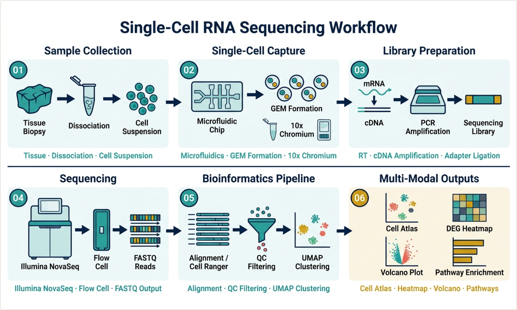
- BioRender — a large icon library built for life sciences; popular, though primarily focused on illustration.
- FigureGuild — a newer, researcher-focused platform that combines a data-driven chart builder, a multi-panel figure assembler, and an AI-assisted graphical abstract generator in one workspace, with journal export presets.
A note on AI tools, since many have appeared recently: be cautious with anything that generates your data or statistics. For the chart portion of an abstract, your numbers should be computed from your real data, not invented by a model. (This is the principle FigureGuild is built on — AI assists with layout and illustration, while statistics are computed locally from your data and never fabricated.)
A quick way to make one with FigureGuild
If you'd rather not start from a blank Illustrator canvas, here's the short version of the FigureGuild workflow:
- Open Abstract Studio and describe your research in plain language — your system, your finding, the mechanism.
- Generate a draft graphical abstract in a publication style, then refine the layout and labels.
- Add any data panels from the Graph Builder (real charts computed from your data — bar, box, survival, volcano, and more).
- Export to your journal's spec (PNG, PDF, SVG, or TIFF, at 300–1200 DPI).
You can try FigureGuild free at figureguild.com.
Common mistakes to avoid
- Too much detail. A graphical abstract is an overview, not a results figure.
- Tiny text or low resolution. Print a test at the final size to check readability; export at the journal's required DPI.
- Inconsistent style. Mismatched fonts, colors, and arrow styles look unpolished.
- Wrong dimensions. Always design to the target journal's specs.
- Misrepresenting results. Use the same terminology as your paper; don't let the visual overstate the finding.
Final thought
A graphical abstract is worth the effort: it's increasingly required, it makes your work more discoverable, and it helps readers grasp your contribution in seconds. Keep it to one message, sketch before you build, design to your journal's spec, and simplify ruthlessly. Whether you use Illustrator, BioRender, or a researcher-focused tool like FigureGuild, the principles are the same — clarity over decoration.
Building figures for a paper? FigureGuild helps researchers create publication-grade plots, multi-panel figures, and graphical abstracts from raw data — AI-assisted, with statistics computed locally so your data stays yours. Free to try.